1. Choose Paint Colors Based on the Room’s Orientation
When selecting paint colors for your living room, it’s important to consider the direction it faces. Here’s a general guideline:
For Rooms with Plenty of Sunlight: If your living room faces a direction that receives a lot of sunlight, such as east or west, it may feel too warm. Opt for cooler shades to balance the warmth and create a comfortable environment. Soft blues, greens, and grays are excellent choices to neutralize the intensity of the sunlight.
For Rooms with Limited Sunlight: If your living room doesn’t get much natural light, choose warmer, brighter colors to add warmth and vibrancy. Shades like warm beige, light yellow, or soft oranges can make the space feel cozier.
Expert Tips from Singworld
East and West-Facing Rooms: These rooms receive ample sunlight throughout the day. It’s best to choose light, cool colors to counteract the intense sunlight. Blue tones are commonly used to soften the brightness and create a relaxing atmosphere.
North and South-Facing Rooms: These orientations may lack natural light. Opt for warm or bright colors to compensate for the reduced sunlight and enhance the room’s warmth.
Northeast-Facing Rooms: This direction often experiences cold winds in winter. Warm colors like orange and light pink are suitable choices to add coziness and counteract the coldness.
Northwest-Facing Rooms: These rooms can get very hot in the afternoon. Choose cooler shades to create a refreshing and pleasant ambiance.
Southeast and Southwest-Facing Rooms: These directions generally enjoy a balance of cool breezes and stable light. Soft, light colors work well to maintain a harmonious environment and ensure the space feels balanced and inviting.

Choosing Paint Colors Based on Space and Style
1. Selecting Colors According to Room Size
The paint colors you choose for your living room should take into account both the floor area and the ceiling height. Here are some tips:
For Smaller Rooms: To make a small room appear larger, opt for light colors such as white, light yellow, soft green, or cream. These hues help create an illusion of more space and make the room feel airy and open.
Ceiling Color: For a more harmonious look, experts recommend painting the ceiling a lighter color than the walls. This technique can make the room feel more spacious and balanced.
Floor and Wall Color: If you want to create a sense of openness, choose a wall color that is darker than the floor color. This contrast can make the room feel larger and more expansive.
2. Defining a Clear Style for Your Living Room
Before selecting paint colors, it's essential to define the style you want for your living room. Different styles complement different color schemes:
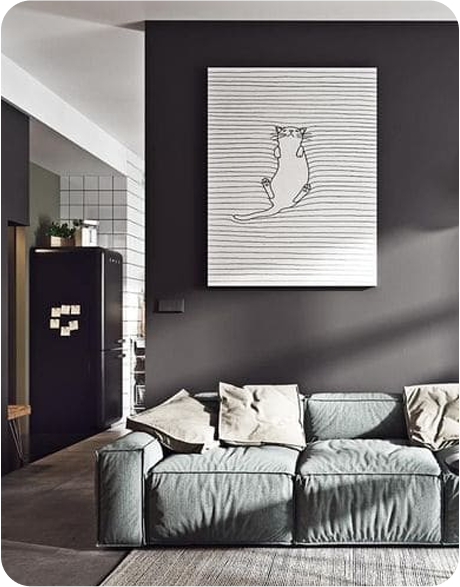
Modern Style: Opt for neutral or monochromatic palettes with bold accent colors. Whites, grays, and blacks paired with vibrant hues can create a sleek, contemporary look.
Traditional Style: Rich, warm colors like deep reds, golds, and browns work well with traditional decor. These colors add depth and a classic feel to the space.
Scandinavian Style: Light, airy colors such as soft whites, pale blues, and light grays align well with the Scandinavian aesthetic, which emphasizes simplicity and natural light.
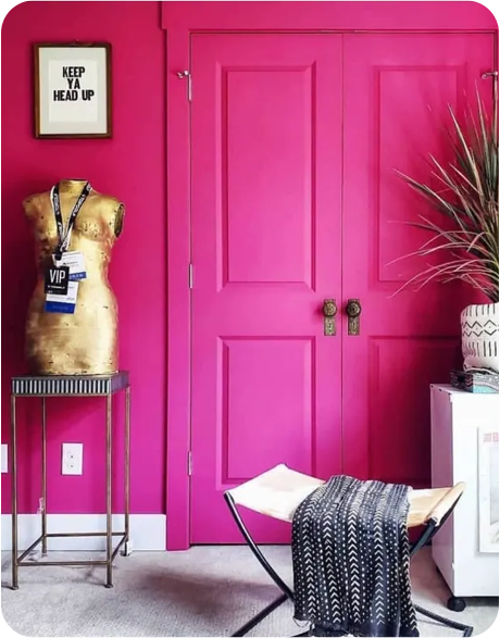
Bohemian Style: Embrace vibrant, eclectic colors and patterns. Jewel tones, deep purples, and rich oranges can enhance the eclectic, artistic vibe of a Bohemian-inspired living room.
Minimalist Style: Stick to a restrained color palette with whites, blacks, and neutrals. This approach helps maintain a clean, uncluttered look.
By considering the size of your living room and the style you wish to achieve, you can choose paint colors that enhance the space and align with your design vision.

The living room should have a maximum of 3 colors
Color coordination for the living room is a smart way to showcase the homeowner's personality and style. However, overusing too many colors can make the room visually overwhelming. For any space, the color distribution should follow the 6-3-1 rule: 6 parts for the main color, 3 parts for supporting colors, and 1 part for accent details that create special effects.
Unique Living Room Painting Ideas
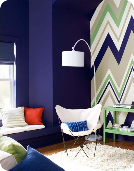
1. Using Stripes with 2 or 3 Colors
A popular technique in wall decoration is stripes. Homeowners can use two or more colors to create striped patterns. For example, using white and red or three colors, where thin white stripes are placed between larger colored stripes, can emphasize the two main colors.

2. Abstract Design According to Creativity
Another interesting idea is to design an abstract painting on the living room wall. Forget about traditional rules and symbolic designs; unleash creativity by combining colors and geometric shapes. Using harmonious and well-thought-out colors, along with creative and unconventional ideas, will give the wall an impressive and standout appearance.
3. Ombre Style Design
Decorating the living room with an ombre style creates excellent flexibility for the space. This design makes the wall seem to blend seamlessly with the ceiling and surrounding walls, eliminating rigid edges and straight lines, which brings a cozy and fresh feeling.
A gradual color transition from dark to white, combined with living room furniture such as sofas and rugs, creates a cohesive and natural flow in the space.
Ombre colors can be combined with other wall painting techniques, such as V-stripes on one wall, using darker shades at the bottom, and gradually adding white to lighten the stripes until the saturation difference fades. The wall becomes extremely impressive and standout.
Ombre walls can also create a serene and beautiful atmosphere. This effect can be used in other spaces such as bathrooms or hallways. You can even create interesting textures on the walls by using a sponge to apply color, creating beautiful and striking patterns.
4. Creating Color Waves
If stripes seem too rigid or outdated, try something more innovative like colorful waves, which create a striking effect when using more than two contrasting colors. This approach allows homeowners to creatively design the wall as a unique and impressive artwork.

However, aside from choosing an attractive interior style and color, homeowners should also pay special attention to the quality of the paint, given the prevalence of low-quality paints in the current market.